
Fancy Network Mapper
Fancy Network Mapper is a lightweight, open-source live network topology and traffic monitor for your own fleet. A Go agent reads conntrack on every host, a single collector binary serves a live force-directed graph of instance-to-instance traffic, and a report tool turns daily rollups into HTML charts. No Docker, no database, no npm.
This is a fun-project writeup, not a product announcement. Nobody asked for this, nothing about it is enterprise-grade, and it is absolutely not something you should point a compliance auditor at. It was built over the course of one very long session because a very specific itch needed scratching, and it turned out to be a genuinely good time to build. Here's the story.
The itch
I run a small pile of servers — a couple of Postgres boxes doing HA with Patroni and etcd, a Valkey/Sentinel setup, RabbitMQ, a monitoring box, some app servers, the usual sprawl you get once "just one server" becomes "actually, a fleet." At some point I wanted a very simple answer to a very simple question:
"What is talking to what, right now, and how much?"
Surprisingly hard to get a straight answer to. There are big, serious tools for this — ntopng, Netdata, Weave Scope (RIP), Scanopy — and every single one of them is either too heavy, too Docker-centric, too focused on one host instead of a fleet, or missing the one thing I actually wanted: a live, moving picture of instance-to-instance traffic, with actual throughput, that doesn't need a Kubernetes cluster to run.
So, obviously, the correct response to "no tool does exactly this" is to build a small one yourself instead of just living with it.
What it actually is
Two Go binaries and a folder of vanilla HTML/CSS/JS. That's it. No Docker, no database, no reverse proxy requirement, no npm install. An agent runs on every box you care about and watches the kernel's own connection-tracking table (conntrack — the same thing iptables/nftables use to know which packets belong to which connection). It doesn't sniff packets, doesn't need a mirror port, doesn't do anything fancy — it just asks the kernel "what connections exist right now" and reports them.
All those agents talk to one collector, which is just a single static binary serving two ports: one for agents to report to, one with a browser UI showing the live result. The whole UI is a force-directed graph you've probably seen a hundred times in different tools, except this one is hand-rolled in about 150 lines of plain JavaScript because — and I will die on this hill — I don't trust npm packages for anything that touches infrastructure. For the browser-facing bits, sure, whatever, but the actual data plane stays dependency-free.
localhost:7007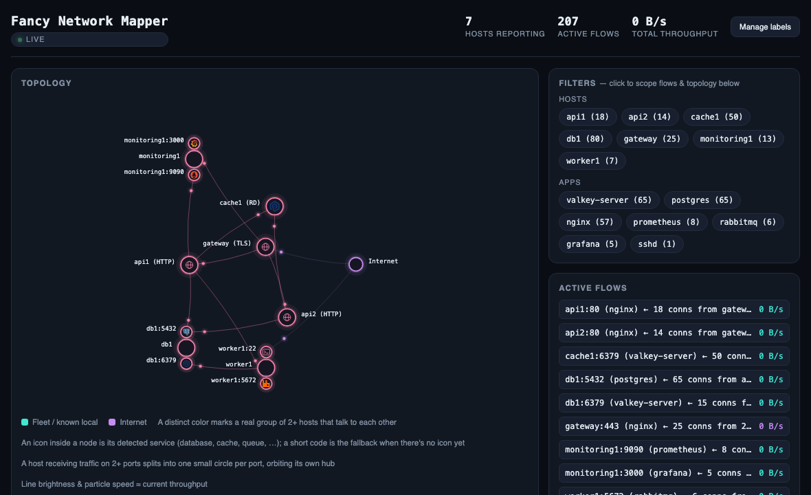
The fun bits
A few things came up while building this that were genuinely satisfying to chase down, in the "oh THAT'S why" way that makes debugging worth doing.
The case of the host with too many ports. At one point a database box started showing up with a dozen little port-circles orbiting it, most of them at completely random-looking port numbers like 55944 and 56702. Those aren't real services — nobody runs anything on port 55944 on purpose. Turns out: that box's Valkey and etcd processes had been happily talking to their cluster peers for eleven days straight, and the firewall rule that makes the kernel actually populate its connection-tracking table had only been added a few hours earlier. The kernel's own bookkeeping for "who dialed this connection" gets decided by whichever packet it happens to notice first — and for an eleven-day-old connection, that's basically a coin flip, not the truth. The fix ended up being delightfully simple: if one side of a connection uses a random high port and the other uses a well-known one, the high one is almost certainly the client, full stop, regardless of what the kernel's own metadata claims. Confirmed it by staring at ss -tnp output until I believed it, then wrote a test so it never sneaks back.
Turning "PG" into an actual elephant. The service badges started as three-letter text codes (PG, RD, MQ) because I didn't want to ship a UI with brand logos in it for no reason. Eventually there were enough of them stacked on a busy host that it started reading like alphabet soup, so they became small hand-drawn generic icons (a database is some stacked disks, a cache is a lightning bolt), and then — once a proper logo pack showed up — real product logos for the services that have one. Text → shapes → logos, in that order, purely because each step made the previous one look worse by comparison.
Ports as branches, not balloons. The very literal first version of "show me which port is busy" gave every port its own fully-simulated node in the physics engine, which is correct in spirit and a disaster in practice — a host with five ports doesn't need five things independently repelling and attracting everything else on screen, it needs five little satellites orbiting their own parent quietly. Once ports stopped being physics objects and became fixed decorations on their host, the whole graph calmed down enormously, for free.
What it's genuinely good for
Watching a fleet breathe. Catching the "wait, why is that box talking to that other box" moment before it becomes a real problem. Confirming a deploy actually rerouted traffic the way you expected. Looking vaguely impressive on a second monitor.
What it's not (yet)
It's not production-hardened, and it hasn't been load-tested at real scale — see the fair-warning note in the README. The topology view runs its whole physics simulation client-side in the browser, which is a fun and simple way to build a force-directed graph and a slightly less fun way to be gentle on someone's laptop fan if the fleet gets big. If you run this somewhere real, keep an eye on it; don't assume it away.
The traffic reports also got graphs
Somewhere along the way, "just a live view" stopped being enough — sometimes you want to know what happened yesterday, not just right now. So there's a small reporting tool that reads the collector's own rolled-up daily traffic files and can spit out either a plain-text table or a proper HTML report with actual charts: top devices, top ports, a daily trend line, and a per-device breakdown so you can answer "which port on which box" without squinting at a spreadsheet.
netmap-report -dir ./traffic -from 2026-09-17 -to 2026-09-23 -html report.html
report.html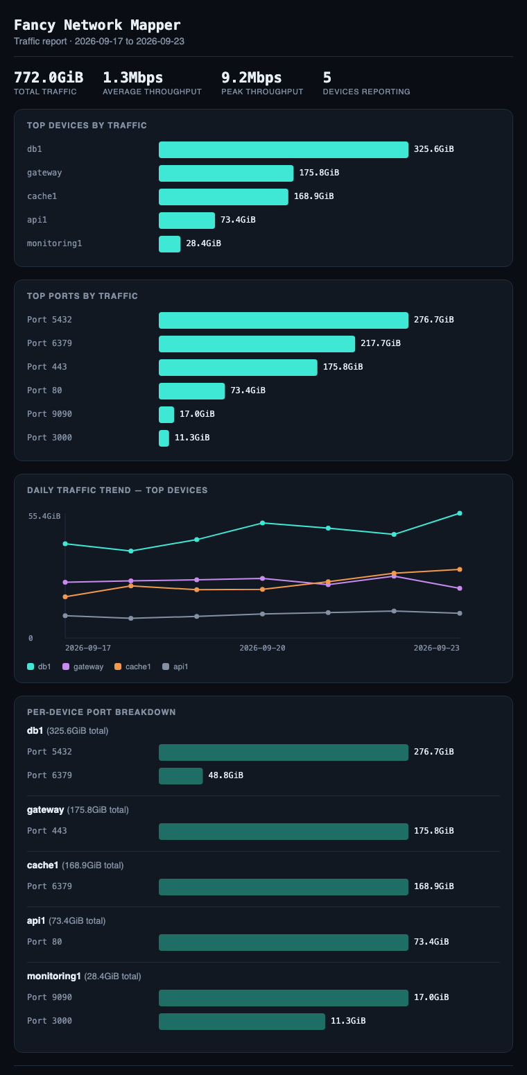
Try it
It's on GitHub: github.com/Raspiska-Ltd/fancy-network-mapper (MIT licensed). Grab a prebuilt binary from the Releases page, or build it from source — either way, INSTALL.md walks through the whole thing, systemd units and all, with a diagram if you're the kind of person who likes diagrams (I am).
If you run something similar and find a way to make the physics simulation politely apologize to people's CPUs, I'd genuinely like to hear about it.
Technologies Used
Frontend
Backend
Other
Related Projects
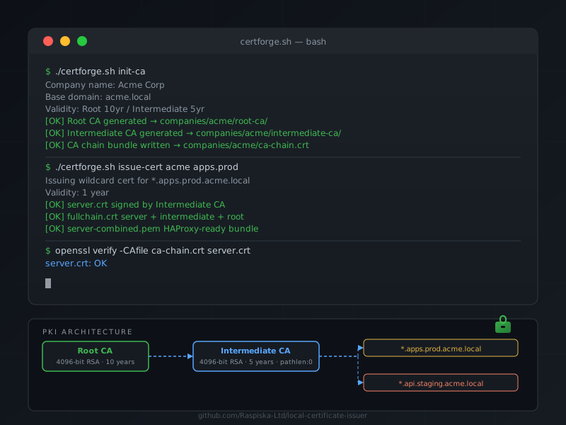
CertForge
A single Bash script that sets up a two-tier private CA (Root + Intermediate) and issues wildcard SSL/TLS certificates for internal services — no daemon, no dependencies, just OpenSSL.
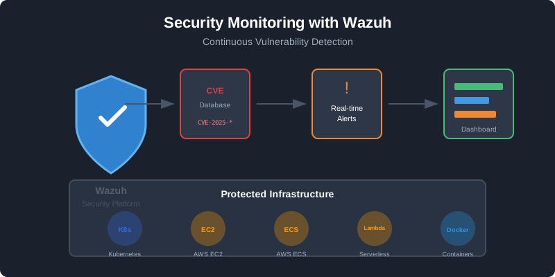
Wazuh Already Ships OpenSearch — Stop Installing a Separate One
Wazuh bundles OpenSearch as its indexer. If you are already running Wazuh agents, you have a capable search cluster sitting right there — no second installation needed. Here is how we extended it to collect system metrics, port inventories, and web logs.
Have a project in mind?
Let's work together to bring your ideas to life. Our team of experts is ready to help you build something amazing.